|
experimentation and know-how are the keys to great images
nirvana by Vicky Uhland If there were one easy, accepted way to screenprint on black shirts, this story would only be two paragraphs long and you wouldn't read it anyway, since you'd be too busy turning out millions of perfect, cutting-edge black garments and counting your millions of crisp, new dollar bills. But life, unfortunately, is full of reality, and the reality in this case is printing on black shirts is hard. It takes patience, inventiveness and know-how. As a result, there is no one quick, correct way to do it. So settle in, and in the next couple pages, we'll tell you how some of the experts make images on black shirts pop out and grab you. "There's no shortcut to printing on black shirts," says Rick Roth, owner of Cambridge, Mass-based Mirror Image. "You just grind away at the problem. You need to be curious, to experiment-it's a lot of work, a lot of thinking. It's not for the faint of heart." Says Andy Anderson, owner of Nashville-based Anderson Studios: "The difference between printing an ink on a white shirt and on a black shirt is you try to assimilate the same properties as a white material." There are two main techniques to do this: four-color process and simulated process. Four-color process relies on underprinting. Its advantage is colors print bold and true and it works well for experienced printers with the dedication to pay attention to smallest detail and keep meticulous records. Disadvantages include the amount of labor it takes, the possible heavier hand to the garment and the fact you have to have darn good press operators to pull it off. Simulated process is good for intricate drawings or photos and allows the artist to break a design into halftones of various colors, thus alleviating underprinting. It also gives a softer feel to the garment. "It simulates the look of a process print with opaque colors," Anderson says, and because there is no underprinting, it works on any color shirt." But in order for simulated process to work, you need a crackerjack art department-either someone at home in a darkroom or a computer whiz. If you go the computer route, it's expensive. Another disadvantage is that simulated process almost always requires a 12-color press, or larger. If you choose to print using four-color process, you need to know your inks. Opacity is your watchword. "Underprint is key," says Steve Batts, general manager at 20-20 Design in Springfield , Tenn. "The rest of your print is only as good as your underprint." Anderson says the secret is choosing the most opaque white you can find. "If it's not opaque, the colors wash out, gray out because the white is gray." Batts says in the last six months, he's been working with the new plastisol opaque inks. As a result, he says, blues, greens and purples don't have to be printed on a mask; they can be laid straight down through a heavy mesh. This makes the print much sharper, he says. The disadvantage, he points out, is sometimes he has to flash cure up to three times on a print. "I sometimes wonder if it's too labor intensive," he says. Another advantage to underprinting with color, says Gregg Perkins, art director at CTM Mfg., St. Petersburg, Fla., is by layering different opacities, you can achieve color change. "You can lay down the transparencies first, then back them with opaque inks," he says. Roth experiments with a thin underprint and a thick opaque, or a thick underprint with a thin opaque or transparent overprint inks, which add translucency to the color. "That's all you see in the store-like Super Bowl stuff-halftone underprints with color over them," says Mike Uyesugi, graphic designer at Twinsburg, Ohio-based Universal Screen Arts. "It seems to be a trend, and it's also easier to create other colors because you don't have to flash all the time. It also saves time because you don't have to wait for the shirt to cool down." Roth likes quartz flashes, because he believes they are quick and easier to control. The minus, he says, is if you use different fabrics and textures on one press run, the quartz is harder to work with because it needs to be adjusted. "Some garments flash fine, and then we had some that almost caught on fire." A rule of thumb when choosing ink opacity, Roth says, is athletic shirt-type printers like thick ink, whereas those who work with fine art don't like the plastic feeling of the heavy inks. If you choose simulated process, experts say the artwork is important. If a customer comes in with a design for a white shirt he wants printed on black, don't waste your time trying to adapt it, experts say. "There are certain problems not worth solving," Roth points out. Steer your customer away from neons or from prints with a lot of black, he says. Also, designs with big areas of color can spell trouble, because it's hard to have big, smooth patches of color. Artists can make the halftones necessary for simulated process either in the darkroom or by computer. Darkrooms take time and labor but are hands-on, giving the artist control and feel; computers are fast but are expensive and take time to learn. |
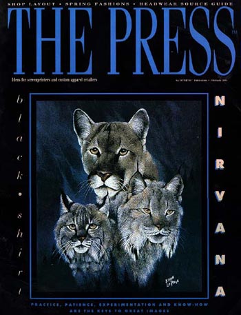 Jeff Wood, creative director at Island Screenworks, Garden City Beach, S.C., is a computer guy. He says his shop only uses underprints in about 5 percent of the black shirts it prints. Instead, he stacks halftones and uses those colors as underprints. For instance, to achieve a fire-colored shirt, he uses a yellow halftone under orange, orange halftone under red, and so on, untill fire leaps off of his shirt. "In simulated process, you can use eight spot colors and no underprint," he says. "It keeps the hand real soft." Wood, who does a lot of rock artist prints, says simulated process works well when you're using a picture off of an album cover. Take Kurt Cobain, former Nirvana lead singer, for example. Wood says he would use four flesh tones to create the face, a couple of layers of blue for the eyes and two golds for the hair, with maybe one of the flesh tones for depth. Island Screenworks does all of this on computer. "It's 30 minutes on a computer as opposed to a week manually," Wood says. "Instead of going into a darkroom and taking airbrush patterns and pulling them through a screen, you set halftones in computer set-shapes. You can generate that hand-stippled look. "But to work on computer, you have to rely on a computer-literate artist," he adds. "A lot of managers who put in computers don't realize there's a six month learning curve just to be comportable with the equipment, and then another six months just playing with it, making mistakes." Another factor to consider with compters is not only the expense of buying them, but also of producing the art. "Can you afford $35 a positive to get the output on film?" Wood asks. "You've got to weigh your time versus money." Roth says when working on computer, it's important to gear your separations to your press and printing technique, or get a really good separator and work with him or her. "Separators don't understand screenprinting, no matter what they say," he says. Uyesugi says he recently did a butterfly design on the computer. "If we had hand-separated the butterflies, we would have to had done it almost like animation. We could have spent a week on separations but on the computer it took a couple of hours." But, he points out, "Computers arn't as tight on registration as the photo technique." Uyesugi says he has an adaptation which adds depth to simulated process. It calls for three whites and one black and takes three steps. The first step uses a white halftone underprint, and then it's flashed. Step two is a mid-range white after the other colors to create a blend, and the third step is a highlight white as a final color - little specks to create a shimmer, or a 3-D effect, like the line on the edge of a glass. Black is added for the final dark shadows and to create depth. "You get a full range of lights and darks and grades of color," he says. Wood also offers some ink tips for simulated process. He says he gets his ink department to mix colors he can step on one time and still get color; but he likes to be able to step on inks as many as six times and still be able to achieve opacity. This works especially well on purple, He says. "We came up with a purple that was soft, eerie, dark and deep, because the ink had been driven down into the shirt so many times," he says. "We press on the hardest substrate first and then go from there," Perkins says. "Then we know what we want." Roth also points out it matters what color of shirt you use. There are reddish blacks, greenish blacks and bluish blacks, and they can affect your colors. Also, different weaves take inks differently. "Sreenprinting has so many variables - the humidity of the shirt, the heat you're working in, etcetera," he says. But, with a little practice, you can achieve the nirvana Steve Batts seems to have attained. "Blacks to me anymore are a piece of cake," he says. |
All material designed and copyrighted by
Questions or problems to report about this web site? Contact the Webmaster at webmaster@mirrorimage.com