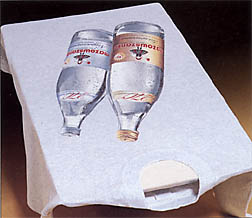
| I've said it before and I'll say it again: a magazine's front cover is one of its most important-and difficult-to-execute-elements. It sets the tone for the whole book. It summarizes what's inside. It demands: "Read me!" ...or it doesn't. Curiously, some of our most successful covers have turned out to be the easiest to produce. Last month's is a good example. (No, not the cover-wrap with the frantic fellow who's "gotta have his Printwear," but the cover, underneath, that featured the award-winning waterbottle print, shown to the right,) We've been getting a great response to that cover, and there's little wonder why: the print. That's right, our successful cover rides squarely on the strong shoulders of a successful piece of apparel graphics. Naturally, recognizing... |
 Print by Anne Kalin and John Lynch of Lynka Sportswear, Krakow, Poland; simulated process on an MHM Synchroprint 2000. |
All material designed and copyrighted by
Questions or problems to report about this web site? Contact the Webmaster at webmaster@mirrorimage.com